
Curated Colour Library
Farrow & Ball Colour Library
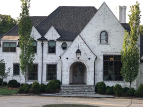
Discover the Farrow & Ball palette arranged in tonal families inspired by the original brochure format. Explore foundational neutrals first, then move through the broader collection by mood, depth, and tone.
Relaxed Neutrals
Perfect for understated decoration, these easy tonal neutrals feel calm, versatile, and quietly architectural.


Architectural Neutrals
A cooler group with a crisp and contemporary cast, ideal for pared-back interiors and clean spatial contrast.


Contemporary Neutrals
These grays bring greater edge and definition, balancing warmth and modernity with a more grounded presence.


Timeless Neutrals
Soft, balanced whites and quiet mid-tones that sit naturally in traditional and contemporary rooms alike.


Warm Neutrals
Understated and inviting, these warmer whites and stones create softness without losing clarity.


Traditional Neutrals
Complex whites with gentle gray-green influence, ideal for trim, ceilings, and quietly characterful interiors.


Heritage Whites & Soft Grounds
A broader family of softened whites, grounded creams, and quiet earth-based neutrals that extend the palette beyond the core foundational groups.


Stone, Gray & Mineral Tones
A moodier family of stony grays, mineral mid-tones, and deeply nuanced darks that give rooms structure, atmosphere, and permanence.


Dusty Pinks & Plasters
Powdered pinks, soft plaster tones, and muted rose pigments inspired by traditional limewashed walls and historic interiors.


Reds & Terracotta
Earth-rich reds, oxidized terracottas, and deep historic pigments that bring warmth, drama, and old-world character to the palette.


Yellows
From pale creams to bold sunlit pigments, these yellows bring warmth, optimism, and a distinctly expressive energy to the palette.


Greens
From fresh botanical tones to deep heritage greens, this family moves from bright liveliness to grounded, richly atmospheric depth.


Atmospheric Blues
Airy, washed blues and softened blue-greens that feel light-filled, coastal, and quietly architectural.


Mineral & Deep Blues
Saturated blues with mineral depth, inky character, and strong architectural presence, ranging from softened marine tones to dramatic pigment-rich colour.


Browse this family while the full curated index is being finalized.
Browse Farrow & Ball Collection