

Which Farrow and Ball Colour Should You Choose? 2026 Guide with Real Room Ideas
Choosing the right Farrow and Ball colour can feel overwhelming.
There are over 130 shades. New colours were introduced in 2026. Lighting, undertones, and room use all play a role. What looks perfect online can feel completely different in your home.
As an official Farrow and Ball stockist, we help customers make this decision every day. In store and online.
This guide will help you:
-
Understand the newest 2026 colours
-
Find the best colours by room
-
See what is trending right now
-
Choose with confidence
What’s New: Farrow and Ball 2026 Colours
The newest release leans into warm neutrals, earthy tones, and soft character colours. These are designed to feel lived-in and timeless rather than stark or overly modern.
Here are the key additions now available:
Duster No. 319
A soft, warm neutral that works well in open concept spaces. It pairs easily with wood tones and natural light.
https://primetimepaint.ca/products/farrow-ball-duster-no-319
Beverly No. 310
A refined neutral with subtle depth. Works well in living rooms and transitional spaces.
https://primetimepaint.ca/products/farrow-ball-beverly-no-310-new
Whirlybird No. 309
A light and airy tone. Great for brightening smaller rooms or hallways.
https://primetimepaint.ca/products/farrow-ball-whirlybird-no-309-new
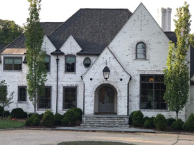
Wine Dark No. 308

A deep, dramatic shade. Ideal for accent walls, dining rooms, or moody bedrooms (Image from Farrow & Ball)
https://primetimepaint.ca/products/farrow-ball-wine-dark-no-308-new
Kittiwake No. 307
A soft blue with a calm, coastal feel. Works beautifully in bedrooms and bathrooms.
https://primetimepaint.ca/products/farrow-ball-kittiwake-no-307-new
Selvedge No. 306
A grounded neutral with a slightly darker tone. Great for cabinetry or feature walls.
https://primetimepaint.ca/products/farrow-ball-selvedge-no-306-new
Hopper Head No. 305
A rich, earthy neutral. Adds warmth and depth without feeling heavy.
https://primetimepaint.ca/products/farrow-ball-hopper-head-no-305-new
Bamboozle No. 304

A bold, energetic colour. Perfect for statement spaces or creative rooms. (image by @simplybathroomsltd)
https://primetimepaint.ca/products/farrow-ball-bamboozle-no-304-new
Tailor Tack No. 302
A soft, understated neutral. Easy to live with and highly versatile.
https://primetimepaint.ca/products/farrow-ball-tailor-tack-no-302-new
Eddy No. 301
A relaxed, muted tone that works across multiple rooms.
https://primetimepaint.ca/products/farrow-ball-eddyno-301-new
Best Farrow and Ball Colours by Room
Choosing by room is one of the easiest ways to narrow things down.
Living Room Colours
Look for warmth and versatility.
Top picks:
-
Tailor Tack for a soft neutral base
-
Selvedge for added depth
-
Beverly for a refined finish
These colours adapt well to changing light throughout the day.
Kitchen Colours
Kitchens benefit from colours that feel grounded but still fresh.
Top picks:
-
Duster for a clean but warm look
-
Bamboozle for a bold statement
-
Hopper Head for cabinetry or lower units
These pair well with natural wood, stone, and metal finishes.
Bedroom Colours
Bedrooms should feel calm and intentional.
Top picks:
-
Kittiwake for a soft, restful atmosphere
-
Eddy for a muted and relaxed feel
-
Wine Dark for a dramatic, cocoon-like space
Bathroom Colours
Bathrooms work well with lighter tones or soft colour accents.

Top picks:
-
Kittiwake for a clean, fresh look (Kittiwake & Charlotte's Locks in image by @baxter_design)
-
Whirlybird for brightness in smaller spaces
Most Popular Farrow and Ball Colours in 2026
Based on search trends and customer demand, these colour families are leading this year:
Warm Neutrals
Soft beiges and layered neutrals are replacing cool greys.
Earthy Greens
Muted greens continue to grow in popularity for kitchens and living spaces.
Soft Blues
Calming blues like Kittiwake are being used across bedrooms and bathrooms.
Deep Accent Colours
Shades like Wine Dark are being used for contrast and mood.
These trends reflect a shift toward warmth, comfort, and personality in interiors.
The Carte Blanche Collection
Farrow and Ball also introduced the Carte Blanche collection. This range focuses on expressive, artistic colours that push beyond traditional palettes.
You can explore the full collection here:
https://primetimepaint.ca/pages/carte-blanche
This collection is ideal if you are looking for something more unique or statement-driven.
How to Choose the Right Colour
Consider your lighting
North-facing rooms tend to feel cooler. South-facing rooms bring out warmth. Always test samples in your actual space.
Understand undertones
Two neutrals can look completely different depending on their base tones. Compare side by side before committing.
Use samples first
Paint large sample areas and view them at different times of day.
Think about flow
Choose colours that connect from room to room rather than treating each space in isolation.
See the Full Farrow and Ball Colour Library
If you want to explore beyond the newest colours, you can browse the full range here:
https://primetimepaint.ca/pages/farrow-ball-colour-library
Shop Farrow and Ball in Toronto or Online
Farrow and Ball is available for in-store shopping at our Queen Street East location.
If you prefer to order online:
-
Free shipping available
-
Delivery in 3 to 5 business days
-
Samples can arrive midweek so you can paint by the weekend
Explore the full range and find the right colour for your space.